What to Show, What to Skip, and When It Matters Most
For most SaaS websites, the biggest conversion problem isn’t traffic.
It’s the first 5 seconds.
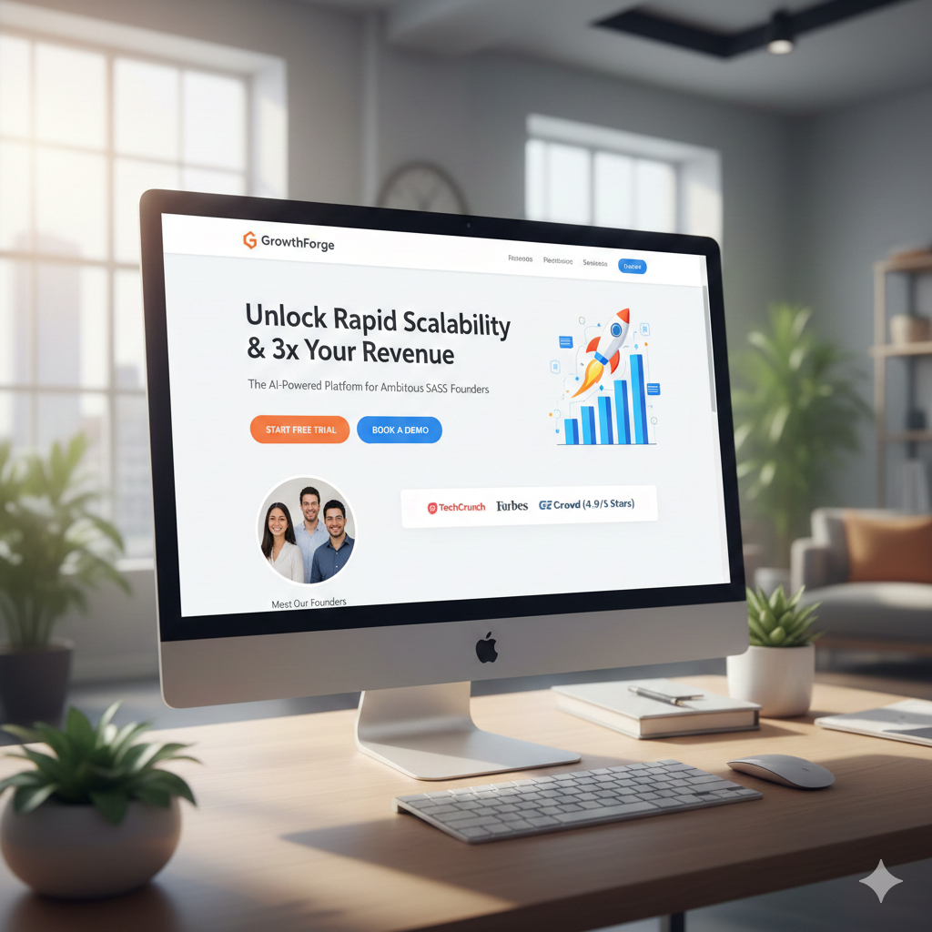
You can spend thousands on Google Ads, LinkedIn campaigns, SEO, and PR—but if your above-the-fold section doesn’t instantly communicate value, clarity, and trust, users bounce. No demo booked. No trial started. No second chance.
After working with SaaS founders across the US, UK, and fast-growing global markets for over a decade, one pattern is clear:
High-converting SaaS websites don’t try to explain everything above the fold. They try to make one thing obvious.
Let’s break down exactly what SaaS founders should add above the fold, when to use each element, and how it impacts conversions at different growth stages.
1. A Clear, Outcome-Driven Headline (Not a Clever One)
Your headline is not a slogan.
It’s a promise.
Too many SaaS homepages lead with vague lines like:
- “Reimagining the future of workflows”
- “The smarter way to scale”
These sound nice but convert poorly.
What to use instead
A specific outcome + audience headline.
Examples:
- “Automate Your Accounting Tasks and Close Books 40% Faster”
- “All-in-One HR Software Built for Remote Teams”
- “AI-Powered Scheduling Software for Healthcare Clinics”
When this matters most
- Early-stage SaaS validating product-market fit
- Paid traffic landing pages
- SEO pages targeting high-intent keywords
If a visitor can’t explain what you do in one sentence after reading your headline, you’ve already lost them.
2. A Supporting Subheadline That Reduces Mental Load
Your subheadline should answer the silent question every visitor has:
“Is this for someone like me?”
This is where you clarify:
- Who it’s for
- How it works (at a high level)
- Why it’s easier than alternatives
Good subheadline example:
“Designed for SaaS finance teams in the US and UK who want real-time reporting without complex setups.”
When to use it
Always.
This is especially important for:
- Complex SaaS products
- B2B tools with multiple use cases
- Non-technical founder audiences
3. One Primary Call-to-Action (Not Three)
Above the fold is not a menu.
Founders often add:
- Start Free Trial
- Book a Demo
- Watch Video
- Contact Sales
This kills conversions through choice overload.
Best practice
Choose one primary CTA, based on your funnel stage.
Use “Start Free Trial” when:
- Product is self-serve
- Time-to-value is short
Use “Book a Demo” when:
- B2B SaaS
- Higher ACV
- Requires explanation or onboarding
Use “See How It Works” when:
- New category
- First-time visitors
- Education is required before commitment
Secondary CTAs should be visually softer, not competing.
4. A Visual That Shows the Product in Action (Not Stock Photos)
This is where most SaaS sites underperform.
Generic laptop stock photos do nothing for trust or clarity.
What works better
- Short product loop video (5–10 seconds)
- UI animation highlighting 1 key workflow
- Explainer micro-video without sound
Even a simple animated walkthrough converts better than a static image because it answers “how does this actually work?” instantly.
When visuals matter most
- Cold traffic from ads
- First-time SaaS buyers
- Non-technical decision makers
If your product solves complexity, your visual should simplify it.
5. Immediate Trust Signals (Without Overcrowding)
Trust isn’t built later.
It starts above the fold.
But this doesn’t mean adding every badge you have.
High-impact trust elements
- Logos of 3–5 recognizable customers
- “Trusted by 5,000+ teams worldwide”
- Security or compliance badge (SOC 2, GDPR, HIPAA)
- Short testimonial snippet with a real name and role
When to prioritize trust signals
- New or lesser-known SaaS brands
- US and UK enterprise-focused audiences
- Paid acquisition pages
One strong signal beats five weak ones.
6. A Clear Differentiator (Why You, Not Them)
Most SaaS founders assume users will scroll to understand differentiation. They won’t.
You need one sharp differentiator visible above the fold.
Examples:
- “Set up in under 10 minutes”
- “No credit card required”
- “Built specifically for SaaS founders, not enterprises”
- “Flat pricing. No per-seat fees.”
This is not a feature list.
It’s a reason to keep reading.
7. Optional: A Short Explainer Video (When the Product Is New or Complex)
For SaaS products in emerging categories—AI tools, workflow automation, vertical SaaS—a 60–90 second explainer video above the fold can significantly increase conversions.
Not always autoplay. Not always loud.
But always clear and skimmable.
Use video when:
- You’re educating the market
- Sales cycles are long
- Your value isn’t obvious in text alone
This works exceptionally well for SaaS founders targeting US and global B2B buyers who want clarity before commitment.
Final Thought: Above the Fold Is About Confidence, Not Completeness
Your homepage doesn’t need to explain everything above the fold.
It needs to do three things well:
- Clarify what you do
- Show who it’s for
- Guide the next action
Everything else can come later.
If your conversions are low, don’t immediately change pricing or traffic sources. Start with the top 600 pixels of your site. That’s where most SaaS growth bottlenecks quietly live.
If you want, I can:
- Rewrite your above-the-fold section
- Create a high-converting explainer video script
- Audit your SaaS homepage from a CRO perspective
Just tell me your product and target market.

